a new look and a better experience
I proposed a new website design for EcoBotl. In addition to giving it a new look, I also improved the user experience. The biggest improvements were made to the header, making it easier for visitors to find the bottle they are looking for and optimize the purchase flow.
research is key
Before I started on a new design, I was curious about any problems visitors might encounter.
To this end, I conducted a small-scale study in which a number of people were interviewed while they were asked to order a bottle.
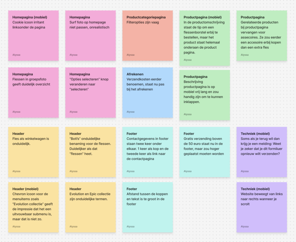
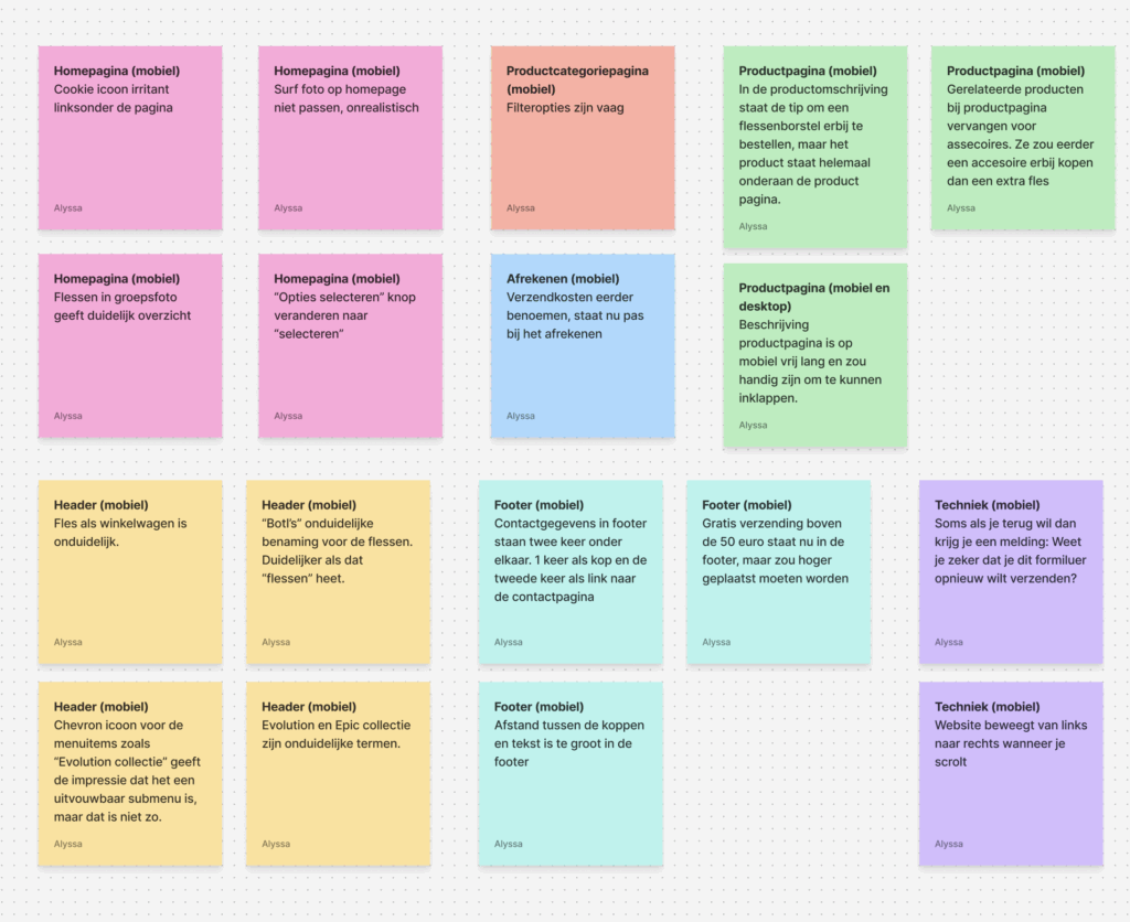
In order to clearly identify the pain points, I collected and recorded the data from the interviews. I then categorized this data per page.
research
Before I started on a new design, I was curious about any problems visitors might encounter.
To this end, I conducted a small-scale study in which a number of people were interviewed while they were asked to order a bottle.
In order to clearly identify the pain points, I collected and recorded the data from the interviews. I then categorized this data per page.
Current user flow
The study revealed the following issues:
The navigation in the header is unclear. Under “Botl’s,” vague terms are used to categorize the bottles. A user does not know what to expect when clicking on ‘Evolution’ or “Epic.”
The bottle icon used as a shopping cart was perceived as unclear by the interviewees.
On the product page, the interviewees found the page to be full of text and additional products. The block containing “related products” was considered superfluous.
The footer states that shipping is free for orders over €50. This was noted by the interviewee, who suggested that this information be displayed in a more prominent place.
Redesign
I kept the design simple and minimalistic. I wanted the colorful bottles to stand out, so I opted for a simple color palette.
I solved the visitor’s pain points as follows:
For the menu, I didn’t categorize the bottles under the collection names, but based on size and type of bottle. This allows visitors to see at a glance which bottles are available and in what sizes.
I moved the message “free shipping over 50 euros,” which was previously in the footer, to the header. This way, it always remains visible.