Minimalistic logo's that communicate the function of the products and fit the company's branding
Summary
The product logo’s for Emendis’ Booking App (an application where users can book equipment from their university or partner companies) and Lead Platform (an application that provides a central system for tracking, managing and analyzing leads) incorporates the company’s brand colors and minimalistic style. The designs are clean and simple while conveying the core function of the product.
Getting inspiration
I started of by brainstorming for terms I associate with the products. With these terms I searched on Pinterest for inspiration and make mood boards.
Drawing and sketching
I start by sketching ideas on paper. Making lots of designs and choosing which ones I want to refine digitally.
This workflow makes sure I won’t spend hours digitally working out concepts that won’t even see the light of day.
Booking App logo
The logo represents a calendar. To give the two dimensional trademark some more movement I added a turning page which uncovers a pink background.
By using a “squirle” (combination of a square and circle) as the ouline of the logo you get a more softer feel that fits the round typography better.
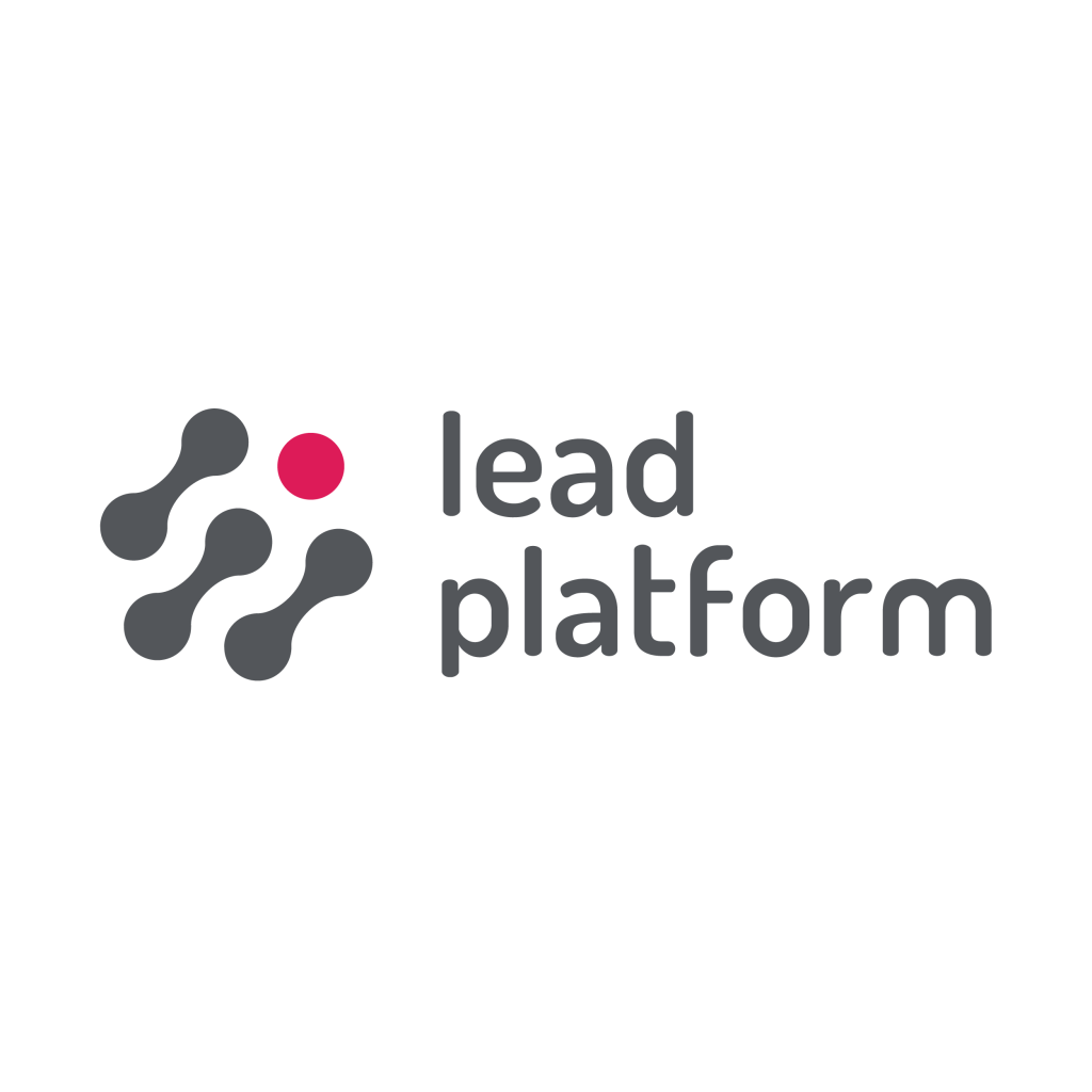
Lead Platform logo
The red circle symbolises the lead platform and represents a magnet that attracts the leads. It’s made pink to emphasise this element and to distinguish it from the grey elements.
The grey elements are derived from existing Emendis product logos. They symbolise the leads the platform attracts.