I designed a whitepaper for Emendis’ API integration software Neqto. By using the correct font sizes and weights, I was able to achieve a clear hierarchy. Icons, visuals, shapes and Neqto’s brand colors were used to support the content. This resulted in an easy and visually appealing paper to read.
Getting inspiration
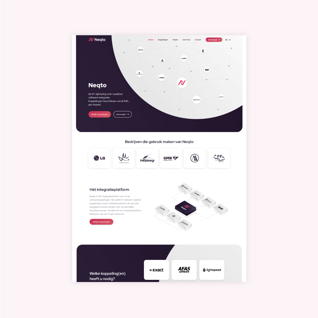
To keep the design of the whitepaper in line with the branding of the product I took inspiration from Neqto’s website. I incorporated the use of round shapes and corner and colors from the website design in the whitepaper.
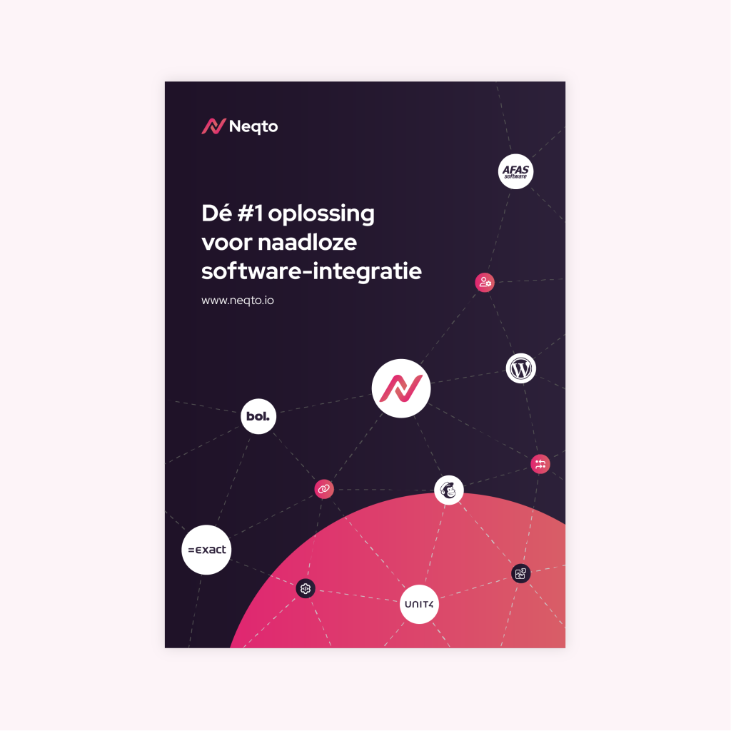
The cover of the whitepaper is inspired by the hero illustration of the website. To make enlarge the contrast between de background and the logo’s, I decided to use a gradient of the pink and orange circle instead of the grey one on the website. This way the contrast between the background and logo’s is greater.
Dealing with lots of text and a lack of space
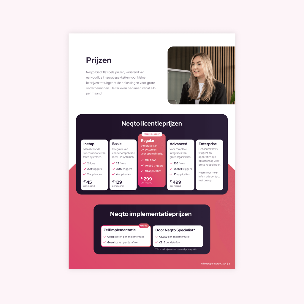
I struggled most with this pricing page. Since the prize categories are an odd number I was only able to display them side by side. This made it difficult to fit all the text in the fixed width of the whitepaper while making sure it didn’t look cramped together.
By playing with the font size, padding and gap space I was able to fit the prices next to each other, while maintaining balance and readability.
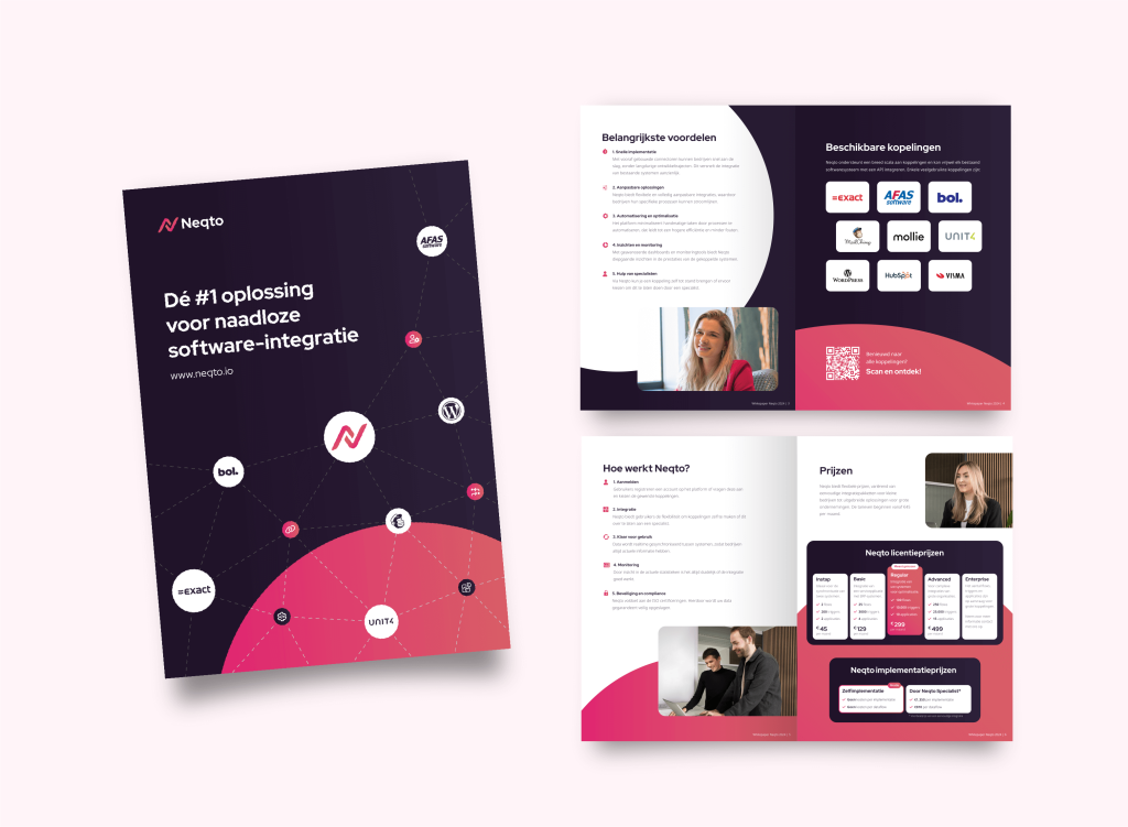
Overall look and feel
Each page has his own unique design while maintaining and cohesive design throughout the whole whitepaper.
I achieved this by alternating between the different brand colors in the background and shapes.
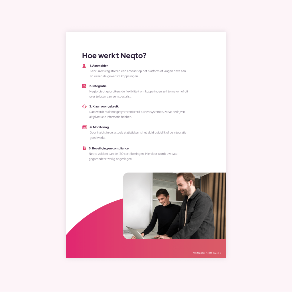
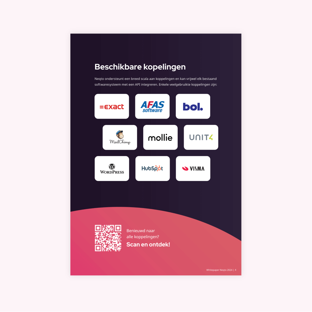
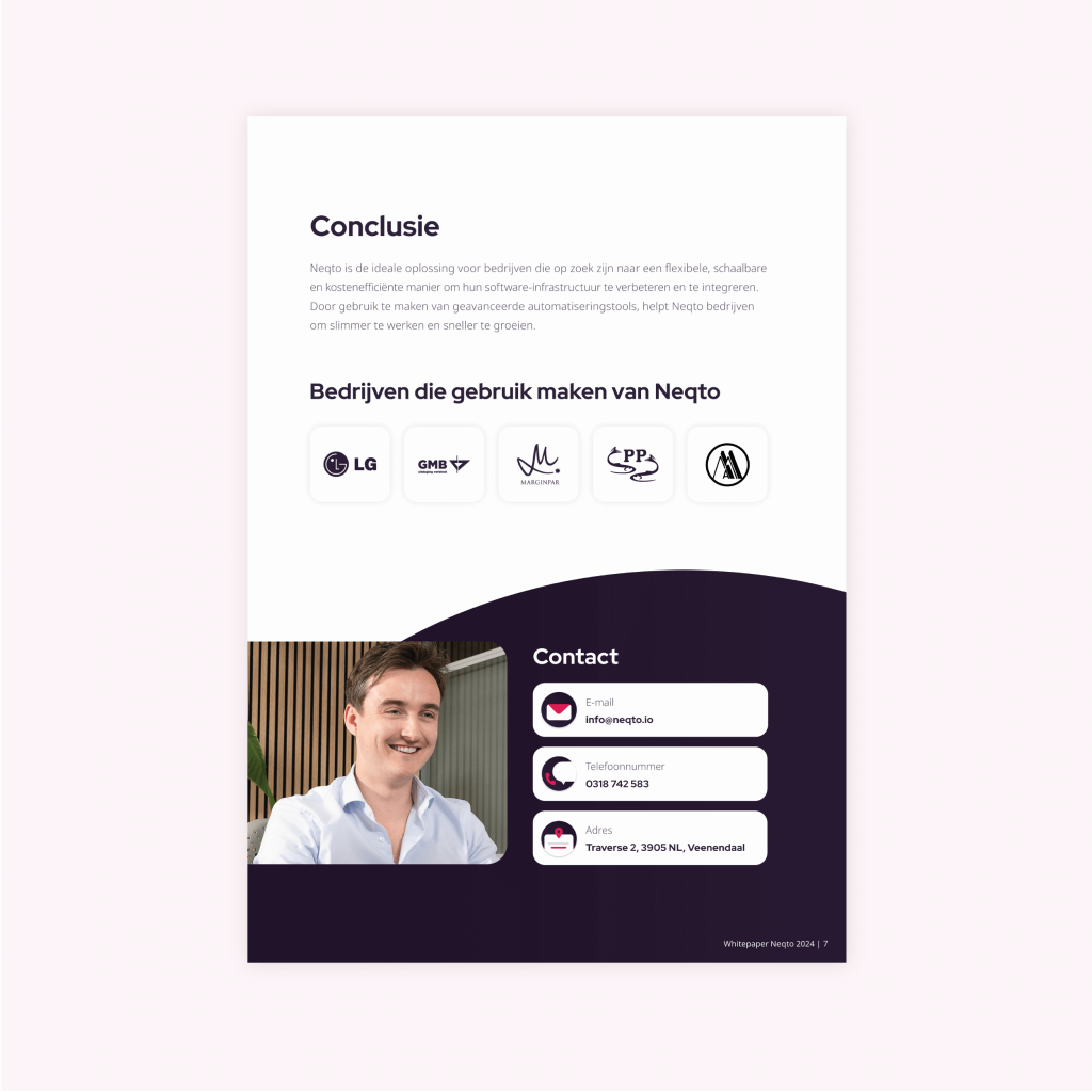
I supported the text with images of the company employees, icons and a qr-code.