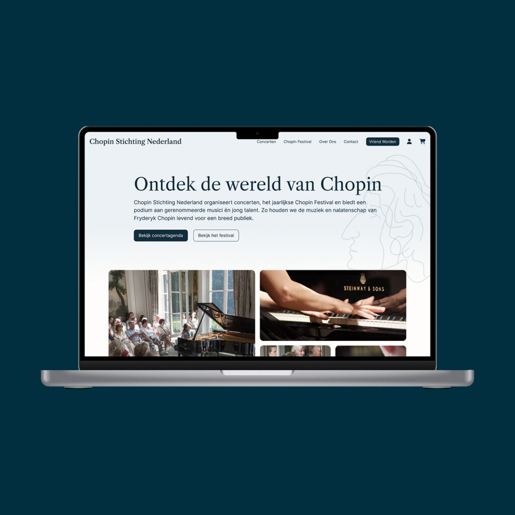
From 54 to 8 steps - Simplifying ticket ordering for the Chopin Festival
Self-initiated concept for a real organisation
From 54 to 8 steps - Simplifying ticket ordering for the Chopin Festival
Self-initiated concept for a real organisation
Problem and Opportunity
For three years, I've attended the Chopin Festival organised by the Chopin Foundation, always buying the season pass for €140. Last year, while browsing the individual concert pages, I stumbled upon something I had never noticed: a youth discount for visitors under 25. Buying all six concerts separately at the youth rate would cost me €90, €50 less than the pass.
The discount existed, but only for those who happened to look in the right place. That raised a bigger question: if a loyal visitor missed it for three years, how many young people never find it at all? For a foundation that wants to connect a new generation with classical music, the ticket flow was quietly working against that goal.
When I ordered differently this year, the foundation noticed at the ticket scan. That conversation led to a homepage proposal they welcomed, and inspired this self-initiated redesign of the ordering process.
Current Flow
Analysing painpoints
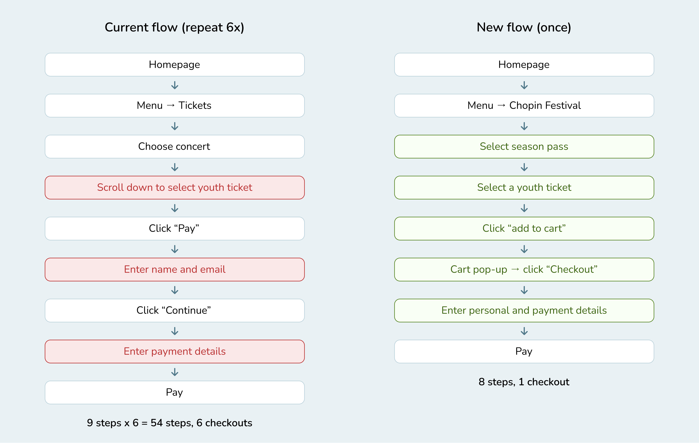
I started by mapping the current ordering flow step by step, using my own experience as a regular visitor as the primary lens. To understand how comparable venues handle this, I benchmarked the concert pages of Het Concertgebouw and Muziekgebouw Eindhoven. Both place prices and ticket buttons right at the top of the page.Three painpoints stood out:
1. The youth discount is hard to find. It's only listed in the price overview of individual concert pages, which on mobile sits at the very bottom. A ticket button at the top does link there, but its white serif text on a yellow background offers little contrast. I overlooked it for three years.
2. The "best deal" is misleading. The season pass is discounted from regular prices, so it looks like the smartest choice. For under-25s, it's actually the most expensive option.
3. There is no shopping cart. Attending six concerts meant completing checkout six times.
Together, these issues meant the people the discount was designed for were the least likely to benefit from it.
New Flow
Design choices
With the painpoints mapped, I set one guiding principle: the best option for young visitors should also be the easiest one to find.
Youth pricing where decisions are made. Instead of hiding the youth rate in individual price lists, I added it directly to the season pass. Young visitors select "+1 youth ticket" for €90, while the regular pass keeps its discount based on regular ticket prices.
One consistent page layout. Following the benchmarks, prices sit at the top of the page, with a high-contrast ticket button. Concert pages share the season pass layout, so visitors only learn it once.
A shopping cart. Tickets are added to a cart, confirmed through a pop-up, so everything is paid in one checkout.
A shorter checkout. Personal and payment details are combined on a single page.
A clearer entry point. "Chopin Festival" in the menu leads directly to the festival offer.
New Flow
Restult and reflection
The result is an ordering flow of 8 steps instead of 54. Buying the full festival as a young visitor now takes one checkout instead of six, at €90 rather than €140: a saving the old website technically offered, but practically hid.
The design is currently a desktop concept. Since many young visitors browse on their phones, and the youth rate is hardest to find on mobile, a mobile version is my next step.
Looking back, this project showed me how much a single personal frustration can reveal about a system. That is also its main limitation: the insights are based on my own experience. Before handing this over, I want to test the flow with other young festival-goers to validate my assumptions.
My conversation with the Chopin Foundation already led to a positive response to my homepage proposal. I plan to present this ordering flow as the next step in that collaboration.